Creative Concepts
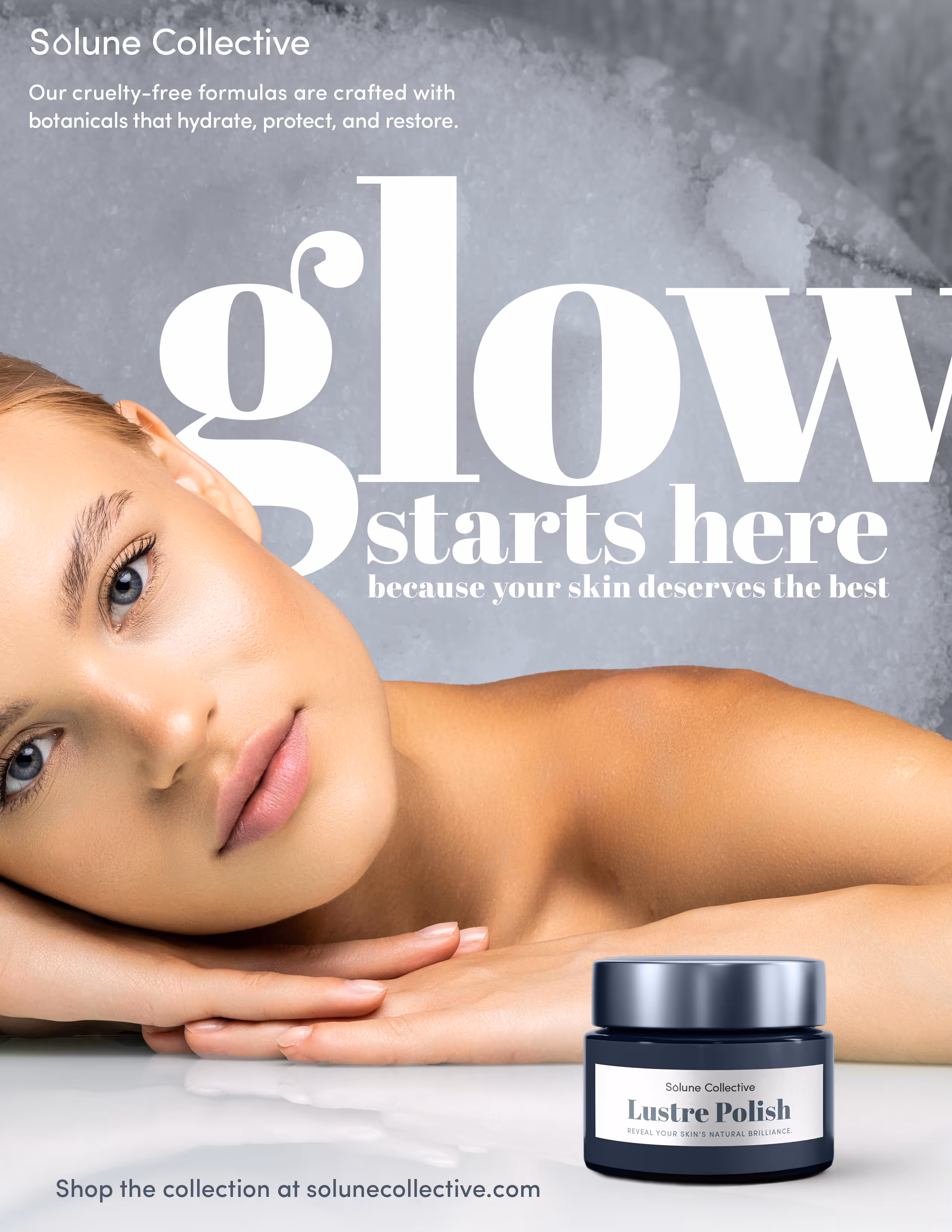
Solune Collective
The Story
Inspired by celestial harmony, Solune combines sol (sun) and lune (moon), symbolizing the balance of day and night, or masculine and feminine energies. Adding Collective to the name reinforces the brand’s inclusive spirit, a place where diverse audiences, products, and perspectives come together under one cohesive identity. Solune celebrates beauty as an expression of both light and shadow, radiant yet grounded.
Who's it For?
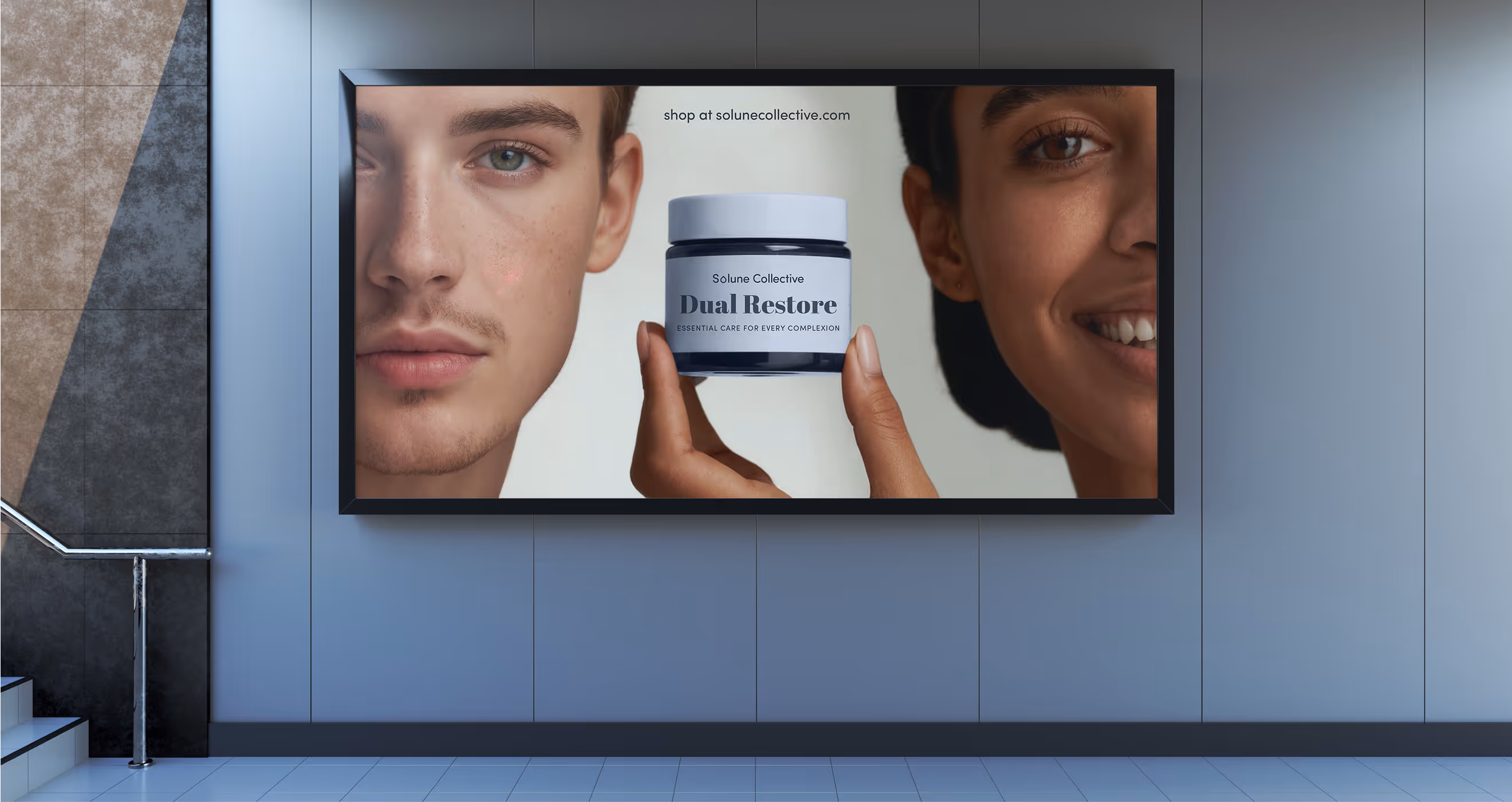
Solune Collective is designed for individuals who value balance, those who seek products that honor sophistication and simplicity. It appeals to modern consumers who appreciate clean, cruelty-free formulas without sacrificing luxury.
The Problem it Solves
In an industry that continues to draw hard lines between “his” and “hers,” Solune Collective redefines what skincare can be by focusing on balance rather than binaries. It challenges outdated marketing and replaces it with an inclusive approach, proving that effective skincare has no gender, only intention.